• Comics
  • Books
  • Illustrations
  • BLOG
  • About
  • Store

BENJAMIN SCHIPPER

  • Comics
  • Books
  • Illustrations
  • BLOG
  • About
  • Store

Editing Comics - a how-to for you.

As I color Joe Death and the Graven Image I come across pages that simply won’t work. This is always a knife-edge decision. I could push that inclination to edit aside and just get on with it. Or, I could make it just a little bit better, increasing the chances that this will be an evergreen book, a perennial seller, and a strong foundation for a larger story, more books, with these characters, in this world. Whenever audience readability is on the line, I usually choose the second option. (Old page on left, edited and redrawn page on right)

In this case, Joe and Blue split up, we follow Blue(the moth) for several pages and then return to Joe. But Joe was on the move when they split up, so returning to him without a far shot of the scene could cause confusion, or at least not set the proper scene for the reader. (My friend Shen Leidigh pointed out my lack of set pieces in previous versions and I’ve never forgotten it.) So how to add one more panel and one that’s large enough to do the job of scene-setting? Reducing the number of word balloons always helps. I didn’t cut any words out, I simply lumped a few separate balloons together. Simplification of the drawings helps as well, and this was actually more of a reason to me than the scene-setting reason. The right-hand page works, but as I tried to color it everything got exponentially busier, all those sharp jigs and jags I use can be overused. The worst offender here is panel 2, Joe’s face, on the original version. Compare it with panel 3 on the redrawn page. The shadows are still in the same place, but their application has been reduced to be less obvious. The best surprise of this edit was changing the last word balloon of the page into a squiggly breath sigh. It’s’ both descriptive and emotive. Descriptive of the weather outside and emotionally portraying Joe’s mind and attitude as he speaks. The reader will understand this intuitively because we’ve all given answers when sighing out heavily. “Make sure to take out the trash tonight honey. Tomorrow's trash day,” my wife says. “si-okay-gh…” I respond.

This is my editing process, I use as much of the original as I can, reducing it and cropping it to fit into the new layout. The only thing new in this first layer is in panel 1, the setup scene. The second layer is just a rough and loose pass over, I’m thinking about shapes and how they all interact with each other, the word balloons as well, they are part of the final art, the printed book. Even if you don’t draw the balloons on your final layer the printed book with the words is how the world interacts with your work so include it as early as you can, in the thumbnail stage.

This third layer on the left is the last refining pass, details are thought about here, trying to button up everything so my final line layer can be as quick and effortless as possible. The final layer is like coasting, my brain is still on but since I don’t have to consider the important factors of composition, character expression, or FX placement (snowflakes, demon-light from sword hilt) I can concentrate on making my edges, my line as interesting, or smooth as possible.

Alright, I’ll be back next week to share what these two pages look like colored. If you’d like to be notified sign up for my email newsletter below. I’ll be sharing open blog articles, recommendations, and exclusive stuff there. And if you’ve found this helpful please consider sharing it via your social media. Thanks!

Subscribe

Sign up with your email address to receive Ole Noggin’ once a week. See you there.

We respect your privacy and will not share your address with anyone. On pain of deeaaathhh.

Thank you!
Thursday 12.02.21
Posted by Benjamin Schipper
Comments: 6
 

Color Me Crazy

By the time I finished drawing Joe Death and the Graven Image I had the sneaking suspicion that the flat, limited color I had been using on previous drafts wouldn’t be good enough for the final. I have two people to blame for this, one from the old school and one from the new. Milton Caniff and Matías Bergara. But before we get to them, check out a few non-spoiler-y pages from Joe Death and the Graven Image.

For fun, I thought I’d include the flattened color layers without the lines, spotted blacks, and word balloons. In reality, there are no true blacks or whites, comics are a different matter of course and print media has its own rules. Color is the middle ground, the hill to die on, the soundtrack to insert. Gradients are a part of nature and as I spend more time outside I notice every color is a shade, progressing from one color to another as the light waxes and wanes, as fires flicker and ovens warm.

Now on to these jokers Caniff and Bergara, these level uppers, these color hustlers! Caniff, is an American cartoonist who was born in Hillsboro, Ohio in 1907 and died in 1988 in NYC. In 1934 Caniff began his legendary comic strip Terry and the Pirates for the Chicago Tribune New York News Syndicate, newspapers folks! Take a look at his stuff.

These are old comics, so I really have no idea how the color was applied but the limitations of color choices are obvious, red, yellow, blue, and the mixtures there of, and they are fantastic. They are luxurious compared to many comics in our modern era, bright, bold, powerful, used strategically. Night scenes in comics and picture books are some of my favorite things ever and these two strips have it going on.

Matías Bergara is a Uruguayan cartoonist most likely known to you all from his groundbreaking work on Coda, written by Simon Spurrier, and published by Boom Studios in 2019. This one knocked my socks off and broadened my color horizons indefinitely. The variety of his linework and ink textures can’t go unnoticed either, absolutely stunning in every regard.

Follow Matías on Instagram immediately AND look for his upcoming book Step by Bloody Step publishing February 23, 2022. You won’t want to miss it!

Wednesday 11.17.21
Posted by Benjamin Schipper
Comments: 8
 

Ole Noggin' - The Newsletter

Hello, everyone!

It looks like it’s been 3 months and a year since last I blogged and about 1 year since posting anything substantial on Instagram. But deep under layers of secrecy, I’ve been working hard to bring you the best graphic novel money can buy. I was also posting very regularly on Patreon, which was a good, good home but after some thought and a great deal of walking my dog I’ve decided to shut it down and post here on my website as regularly as possible. To keep that regularity pumping I’ve developed a stronger, handsomer, helpfuler email newsletter that will keep you up to date with my work and what I’m interested in and looking at via links. For those of you who were there with me on Patreon you have my affection and gratitude and I want you to interact with me here/and through email as freely as you did there. I’ll try to do the same!

And now, at no cost to you, welcome to Ole Noggin!

Subscribe

Sign up with your email address to receive Ole Noggin’ once a week starting November 18, 2021.

We respect your privacy

Thank you!
Wednesday 11.10.21
Posted by Benjamin Schipper
 

Patience is Progress - Life and Work in the Montage

You all know the montage. It’s that part in the movie when everything speeds up, highlighting the weeks, months, or years that the protagonist dedicates themselves to digging deep, working hard, improving their skill. You may also know it by the music which is quicker, hopeful, and full of promise.

The montage always gets me, right there in the center of my being, I can feel the progress, the energy, and excitement of growing power and acumen. This is motivating, so motivating that maybe you leave the theater with a determined stride to take up your cross, submit to discipline, dedicate yourself to the higher calling of writing that novel, running that race, sending more letters, reading more books, volunteering in your community, showing the doubters they were wrong about you, etc. It’s hard to fall asleep in ecstacies like this, but you manage.

The next morning is damp and cold, it’s winter in the South after all, and what’s more? No coffee! After a quick coffee run and some radio news, you’re ready to do your thing. Sitting down with a pencil and paper, surrounded by books and a computer you begin feeling yourself at the center of something great.

You may get through a few days of this before noticing that your first attempts at the epic don’t measure up to your favorite authors, your running pace is slow as mud, volunteering is often a thankless business, and maybe those doubters were right about you. And where’s the music? The dedicated audible theme that lets you, the protagonist, know you’re on the right path? Where is the assurance that even after taking the 7-10 year road of just becoming a journeyman practitioner that you’ll have critical success in your chosen field?

There is none.

You are inside the montage, or more technically you are filming the large scenes that will be edited down to make the montage. Currently, there aren’t enough clips of you doing your thing to even merit a movie. You see, you haven’t done anything yet. You’ve only just begun. The fruits of your labor after 10 years may bring some good things, but what you envisioned ultimately at the beginning of your journey is the fulfillment of a lifelong career, 30-40 years of work.

As Peter Jackson’s Gollum says to Frodo at the mouth of Shelob’s lair, “Go in or go back.” Will you pass into the nightmare? Will you walk into the silence of the tomb with no assurance of ever coming out again? Can you do something else or must you go in? If you can, then leave, go back home, no one but you will know. But if you can’t, and do retreat know that there is a high probability of you becoming a wraith, ghost walking in two worlds, the life you exist in, and the life you want to live in. There is no music in the cave, there are no cameras, pray for the light to guide you through as Frodo did. O Elbereth, Gilthoniel.

If you have no idea what I just wrote please read Tolkien’s Hobbit, Lord of the Rings, and Silmarillion. And now, something a friend of mine made, a montage of me and my work talking about patience. I love it, but it is misleading, hence the above warning about the montage. My hope is that the message of patience will be left in your mind far after the music, and excellent film techniques are forgotten.

This video was made by Will Stewart at Nine Eight Central.

Monday 10.12.20
Posted by Benjamin Schipper
 

Comic Cover Design and Illustration

Anyone out there hear of the comic strip Dunce by Jens K. Styve? If you haven’t that is completely understandable seeing that Jens is Norwegian and the comic strip is primarily syndicated in Norway and Europe, BUT that’s why you read my blog, for all of the cool things you’re missing!

Jens and I met in NYC at the MoCCA Arts Festival and I’ve been following his english translated comic Dunce ever since, you can find it HERE on Instagram. He even featured me as a guest in his comic about his first visit to The Big Apple, I think it’s great and mostly true too!

Now down to business! He’s currently running a Kickstarter for his newest collection of comic strips, this one featuring Brego, his dog, as the main inspiration, check it out HERE and consider backing it if it suits your fancy. I’m a friend and fan of this guy and his work so I wanted to contribute something, fan-art wise, and he invited me to create a guest cover, the image at the top of this article. Let me show you how it was created!

I always start with sketches in a Moleskine notebook, filling up the pages as I try to work out how to draw someone else’s characters. A pretty difficult thing to do I’m realizing as I’ve progressed past more than 100 pages of Joe Death. I’m realizing there’s just so much about a character design and all of the different expressions and poses that’s unique to the main artist, the creator. Specifically, the Dunce characters all have wonderful expressions that would take me quite awhile to duplicate or learn for myself, so I chose a few key ones to experiment with and then started to develop an idea that would work as a comic/book cover.

After sketching the characters I start thinking about their context on a book cover. One of the best ways to make a book cover is to look at other book covers you like. I have several Pinterest boards devoted to books, comics, posters, design, etc. These are places that I’ve been collecting images for times like this, when I need them. I love pulp science fiction material and C.S. Lewis, so this book cover I thought would make a great starting point. I thought it interesting that there were three characters looking out a spaceship at something, my initial idea being to have Brego as a constellation formation outside, maybe suggesting that he’s swallowing the coronavirus. Timely imagery…but Dunce is very timely as well, dealing with current events, so I thought this was a good enough place to start. I mocked up a new cover based on the old book in the new format/size that Jens sent me with his logo, below. The result of the mock up below wasn’t all that impressive to me, but I trust the process and knew I could change the idea later, I just needed a place to start for the illustration.

What you see below are my steps, left to right of making the drawings for this cover. 1) Trace the figures and setting from the Out of the Silent Planet cover. 2, 3, 4, 5) trace and refine on layout bond paper. You can see it below, the proof that I am a hack and I just polish until everything is working to my satisfaction. I hope this is illuminating and liberating to new illustrators, you don’t have to be fully formed with your own genius once you finish “formal education.” It’s my opinion that you just have to work hard and learn from others.

Steps 6, 7) are also tracing but using pro marker paper. Bond and marker paper are both translucent enough for me to trace without a light-box, something I’ve always hated using. I also just traced the inside and outside elements of the spaceship separately since I knew I would have to separate them in photoshop later anyway. Brego is basically the Pepé Le Pew Looney Toon character here, awestruck in love with a beautiful alien dog.

Now I transform into a Computerist as I scan my final lines into Photoshop, clean them up and begin “inking” there, then adding the flat color and the separate elements outside the spaceship. There are multiple in-depth videos on my Youtube explaining my color approach.

At this point, having the final illustration I had a sinking suspicion that my original paperback book plan wasn’t going to compliment this image. My illustration felt too “comic” and less like a painted paperback illustration, they would feel at odds when placed together. But that was very alright seeing that I liked the final illustration, I knew I could find some other parody solution. Weird Science was the obvious choice after looking for a little while. The Dunce: Brego logo that Jens gave me was already bold and stacked just like the Weird Science title. So I mimicked the typography choices in photoshop and added a few of the same marks around it.

Check out my Youtube channel to see and hear more about my process as well as Jens and I discussing cartooning. Here’s the video:

Friday 05.08.20
Posted by Benjamin Schipper
 

The Princess and the Prince - Part 2

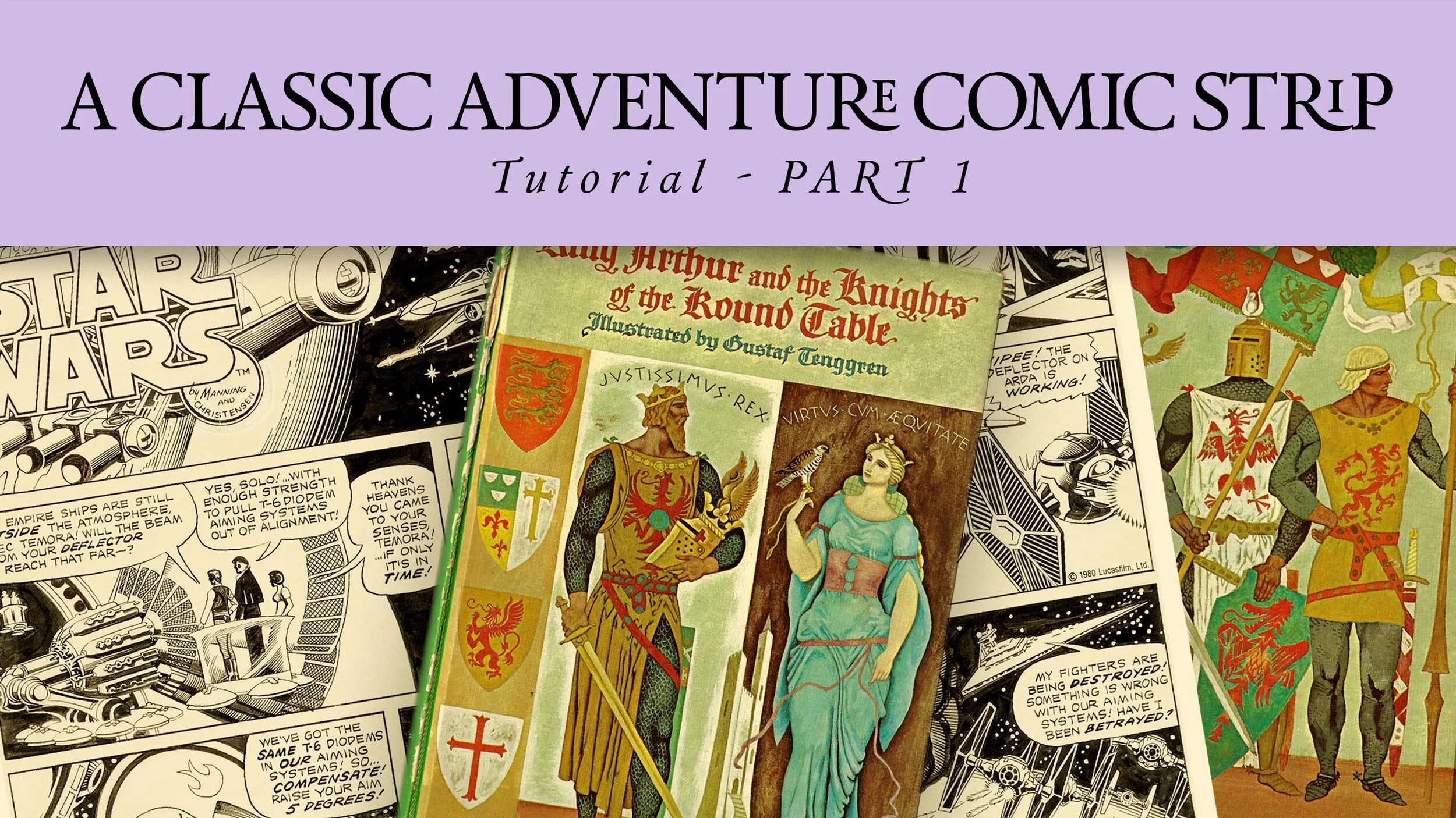
Ok, here’s my contribution to The Princess and The Prince! I had a good time making it and I do like the results. Keep reading to see my process, some great Russ Manning Star Wars comic strips, and another King Arthur book I pulled out as a reference.

After sketching around for awhile there’s really nothing more to do but start drawing the comic. EXCEPT, I did made an Adobe Indesign template based on the size proportions introduced by Hazel’s first comic. I roughly placed my text in each panel. I printed that out at around 14in x 7in. Placing that template under a piece of layout bond paper I traced the panels and then started blocking in my characters and settings, at this first pass I’m just interested in having everything in the right place. The next two tracings are done on layout bond paper as well, just refining and adding detail, making sure the characters expressions are correct.

The fifth stage here is the final drawing, 2B mechanical pencil lead on marker paper. To me, this is not at all an exciting phase, it is the most important, but it’s far from finished. I’ll be scanning this into Adobe Photoshop and essentially “inking” it there. While doing so I wanted to show you another resource that I was/am referencing. Below are some of Russ Manning’s classic Star Wars newspaper comic strips from the late 70’s after the first Star Wars film was released. Take a gander.

All in all I think they’re really charming. The way so many figures, settings and words are crammed into such a small sequence. Each strip is doing a significant amount of storytelling but at the same time not rushing to tell you everything and usually ending on a cliffhanger at the end.

Here’s the second Youtube episode, if you’re interested in seeing how I get from the drawing to the final, inked, lettered and valued comic take a look at both of these Youtube episodes.

The third reference source I’d love to share with you is this Grosset & Dunlap version of King Arthur and His Knights of the Round Table, illustrated by Florian, whoever that is. I’m sure they were well known enough at the time to be known be safe with just one name, but unfortunately time has not kept this Florian above “the heap” of illustrators that have come since, some of them named Florian as well. I think this illustrators best work is in pen and ink, the paintings are competent but I only found one very compelling.

Tuesday 04.28.20
Posted by Benjamin Schipper
Comments: 1
 

The Princess and the Prince - Part 1

My neighbor Hazel drew this comic for me and left it in my mailbox a week or so ago. I’ve been staring at it since and loving everything about it.

I’m currently in the process of responding to her in like fashion with The Princess and The Prince II. I know what you’re thinking, she hasn’t left many loose ends here, it’s a very complete, compelling and exciting one-off adventure. But oh, ho ho, not so when dealing with dark wizards who trap princesses in towers….

As you can see I’m taking her character cues and trying to find out how they would work when I draw them. I trust that she gave her best effort when creating something for me, so I want to give my best effort when it comes to my correspondence to her. So I go with my gut first and then very quickly reach out for reference and inspiration from books like this, King Arthur and the Knights of the Round Table illustrated by Swedish-American illustrator and 1930’s Disney artist Gustaf Tenngren.

This is a wonderful book, and quite rare I believe, published in 1962. I loved flipping through it and getting the tone of an artist who takes the romantic tales of knights, kings, and queens seriously. Tenngren’s mix of realism, abstraction and graphic design are wonderful. This is part of my process but there’s no way of actually knowing just how much of it influences my actual drawing or construction of my comic strip…it doesn’t matter, what matters more I think is the joy received from the gift given by Mr. Tenngren, I can live on that enthusiasm and honesty in art and I know that will affect my final product positively.

I’m also creating a Youtube series about all of this, if you’d like to watch and hear a very long explanation of this same subject, click the image below!

Friday 04.24.20
Posted by Benjamin Schipper
 

"You Just Gotta Not Do It, Man. That's all."

The more I think about time, the things I want to do, and the things I need to do, the more I think about Mr. Badger as he councils Mr. Fox in his tidy underground bankers office in Wes Anderson’s version of Roald Dalh’s beloved Fantastic Mr. Fox.

Badger is suggesting that the house Fox wants would be better left un-bought seeing that it poses a real temptation to Fox’s thieving nature. The house, being situated close to three plentiful and cruel farmers would be too much for Fox to handle, and they would be merciless to Fox and his family if he failed a raid. Badger says,

“In summation, I think you just gotta not do it, man. That’s all.”

When vigilant, I think about this council whenever a new opportunity looks too good to pass up. Why? Because doing something new, anything new, is so often saying “no” to the things I’ve previously committed to.

I would describe myself as ambitious, having more ideas than time to execute them, many of you are like this too and it’s this sort of person I have in mind for this council. For us, it’s often times far more difficult to “not do” some new opportunity, to not start executing the fun new idea we just had in the shower. It’s easy for us to plunge, with vigor, into the new, “blue sky” project getting further and further ahead with it, all the while we are getting further and further away from our old commitments, our comic, graphic novel, book, youtube video essays, etc.

I think our time is very much like a pie chart, take a piece out for one project and you subtract time from all of the others. Failing to understand our time limitations and our proclivities to be excited about the new is far more dangerous than we realize. I’m 30 years old this year, with luck and God’s good grace I’ll have maybe 50 or 60 more years to live, which sounds a long time, until I realize just how little I’ve accomplished in 30 years. Scary!

So be warned, and be wary of the plentiful fields that are not your own, they will beguile you into the grave with nothing much to show for your life. Stay working in your own plot of land so you can one day reap the benefit of your own crop. And what’s more, so the rest of us can as well! A harvest will feed many, so will a good book, comic, podcast, youtube channel, etc.

You just have to “not do” those “other things,” that’s all.

Tuesday 04.21.20
Posted by Benjamin Schipper
Comments: 2
 

A Drink With Tom

Wow! My last blog post was back in January of this year, SIX months ago! I feel bad about that to some extent. As a younger person I remember when blogs were the place to go for information and updates from your favorite creators, now it seems to be all social media. Have blogs all waned away like mine it seems? Well, big question I suppose, let's take a look at this new image I made!

You're probably all familiar with my comic Joe Death, I just finished drawing the second issue and wanted to ease into coloring it by making a one-off single illustration. It's also a chance for me to unwind and do something for "fun" in the larger world of Joe Death regardless of whether or not it fits in with the specific story I'm telling in the comics currently. While this character, what the heck, lets call him Tom, doesn't show up in the first five issues I've planned this type of image is aspirational, almost like concept art. If, like me, you're a fan of Ralph Mcquarrie you'll notice that his design work for the early Star Wars movies is basically showcased in many large illustrations. Instead of just leaving the costume, spaceship and landscape designs on loose vellum pages he integrated them all into finished paintings. There may be a better name for this type of approach when creating a visual world but I like to call it Aspirational Illustrations. They are suggestive, exciting, emotion filled images. Still with me? Let me try to explain the creation of this one.

In addition to loving Mcquarrie's work I'm a huge Dr. Suess fan. His visual language and silliness has always been in the mix of inspiration for Joe Death. A print of this rather obscure and nefarious Suess cat has been hanging on my wall for some time now, I love him. He's a character and a story unto himself. With a little tweaking I think he would sit just right in the world of Joe Death.

I picture him as something of a counterpart to Joe, a lawman of some kind but more street, more city cop. Disheveled demeanor, crumpled clothing, a tramp, completely lovable. One of my favorite parts is the frayed left side of his mustache while the other side remains a bit more composed.

After settling in on a design I thought about the relationship between Tom and Joe. Was it businesslike? Cordial? Competitive? Comradely? It could've been any of these, and maybe all of these have been used to describe their past relationship but in this moment they're old friends sharing a private oasis in the midst of ruins, sand, and stars. Looking at my thumbnails now they all look extremely similar, though at the time I know I was trying something different with each iteration, mainly with the skyline and background.

This is the final tight sketch before the final drawing, I'm also working out the placement of Blue and the exact face and expression of Joe. And lastly, a value study. A part of me will always see Joe Death as a black and white comic but after seeing those bright blues and cozy yellows I'm excited to press on with color.

And lastly (for real this time) if you'd like to know more about Joe Death or even consider supporting it please check out my Patreon by clicking HERE.

Wednesday 07.04.18
Posted by Benjamin Schipper
 

Comic Convention Banner

2018! A new year stretches out before us. Among other things I'm happy to announce that I'll be taking my little show on the road to comic conventions. On February 24-25 I'll be down in Savannah Georgia for the Savannah Comic Con. On April 7-8 I'll be here in NYC at the Society of Illustrators MOCCA Arts Festival. I'm talking to people about a few other shows but nothing else concrete for now. 

Previously I've done a few local shows back in Greenville, SC that were really wonderful but I never got around to making a full banner that could roll up and be easily ported around. The banner will be 36" wide x 84" tall, it has to be eye catching and informative, telling who I am and what I do at a glance.

The notion of making this look like a vintage paperback book did not immediately come to me, but as I thought more about who I am, what I love, and what strongly influences me I couldn't help but going that route. I have an enduring love for those old LOTR and Hobbit covers with the white title backing and elegant black letters, they're clear and inviting, and the stark separation between the illustration and the words I believes compliments rather than opposes, fighting for attention. Before I move on to talk about the illustration I want you to notice the details on both my design and the hobbit cover below. There's a publishers mark and title as well as an ISBN and price, very small but I've come to notice that these types of informational marks make a significant difference. In my opinion they add credibility to the design, as if saying this item is important enough to necessitate additional information, so I made some up for my own design. It's illusionary and a trick but we're talking comic books here, don't fight fair.

Ok, moving onto the content. I thought about what I do best and while I'm under no assumption that I am the best of the best at this I do think I have a knack for character design and relationships between them. So I decided on a very full, character busy scene. That decision was made easier by the separation of title and illustration, I could be certain that there would be no confusion between the two, so the bottom illustration could be as busy as I wanted it. As many of you know I'm working on a personal comic called Joe Death so I chose it's characters to be front and center. I want the world of Joe Death to ultimately feel friendly, bonds of friendship and community are a strong part of the larger story. Character performances are a big part as well, they need to act so I've been diving into cartoon/cartooning material for inspiration. One of the best resources I've found is Walt Kelly's Fairy Tales published by IDW, a collection of comics originally called Fairy Tale Parade. I love Kelly's characters so much, as well as the bright, vivid color palette.

While this is a digital painting, very clean and linear I include the uncropped painting/image below. It feels like it harkens back to the days of old cel animation, something that I love. Insignificant I suppose, but I just want it here and hope you enjoy it. I have a few videos on my Youtube channel discussing some of this paintings more intricate qualities. You can find it by clicking HERE

Monday 01.29.18
Posted by Benjamin Schipper
Comments: 1
 

Star Wars Comics

My love of comics began at an early age, growing out of the fertile crescent that was the original Star Wars movie trilogy. The first single comic issue I owned was Star Wars Bounty Hunters - Kenix Kil. It featured this crazy rogue Imperial Guard and was basically a revenger type story. It was entirely off the beaten path from the films and had nothing to do with the Skywalker family affair. Here's the cover and a few pages. You can get the full issue digitally at Comixology.com. This issue was published in print by Dark Horse back in October 1999.

 Star Wars comics started in 1977, the same year the first movie premiered. Marvel was the original publisher and was so for ten years, producing 107 single issues of Star Wars. From 1991 to 2014 Dark Horse Comics was the home for Star Wars comics and they produced a lot of them, over 100 titles. "Titles" are basically subtitles of Star Wars, for instance Star Wars: Legacy is a title, Star Wars: Empire is another.

Speeding ahead to the present, we now see Star Wars solidly embedded in the Walt Disney Company and therefore the comics are now back at Marvel, which is also owned by Disney. In truth I haven't been following the new Marvel Star Wars that closely. I did love the limited Lando comic as well as some of the Kanaan: The Last Padawan, maybe because those characters are lesser known than Luke, Han, and Leia. I think largely the strength of Star Wars is held in the expanded universe, the comics, books, etc. So when the new comics seem to be circling back to focus on Luke, Han, and Leia I feel in some way that the universe is much smaller than I was led to believe.

I understand that new audiences are just that, new, and so circling back around to the main heroes isn't a bad thing, but I do want to expand that universe a little more. The coolest thing about the era we're living in is that Star Wars is still happening! Comics are still happening! So we have a chance to keep playing in that world, it's not closed off to us who are artists and writers.

Here's where I would love to say that I'm currently working on a Star Wars comic for Marvel, but the answer is unfortunately "no" on that account. BUT if Star Wars taught me anything it was to dream big and work hard. I've got a Boba Fett story kicking around in my head and wanted to make some covers for fun, and yes of course, attention! Please share whatever you see here and if you work at Marvel give me a call someday. But enough about me, lets jump into the project!

Here are three cover designs very loosely based on my story. I start with a pretty simple sketch of the main character Boba Fett. I put those sketches in a comic sized photoshop frame and start playing around with the shadows/light sources, keeping in mind that the highest contrast areas center the viewers eyes. I'm really happy with the first two designs and only moderately with the third, it's a bit goofy, I'll probably change it. When I make three or more of anything I look at them together and think, "what don't I have represented here?" My answer for this is that I don't have a group of people on any of these issues. Boba Fett is the main character of course but Star Wars is a big world, it should be peopled with a multitude of interesting beings. I'll most likely change the third cover from a single enemy to multiples hunter for Fett in the shadows. Stay tuned!

Thursday 11.16.17
Posted by Benjamin Schipper
 

The Only Way I Take My Sports - Goofy

I pause for only a few sport events. Those being the Olympics, the World Cup, Wimbledon and Walt Disney's Sport Goof series of cartoons created back in the 1940's. Here's a few for your viewing pleasure.

Ok, so maybe there's going to be more than a "few" here, but you'll have to admit, they're addicting. There's almost too much to say about these and I meant to say so much already... The number one takeaway for me is the priceless narration. The voiceover is amazing, but the narration in tandem with the animation is perfect. In the children's book world we talk about this a lot, how the illustrations should do something different or add to the words instead of merely reflect them. Since this is a Goofy cartoon the narrator takes on an extremely stuffy, serious tone, while Goofy's actions/situations are the opposite of serious. Whatever is stated as fact is shown in fiction, but perhaps the fiction is closer to reality. 

I also love the way every character in the group sports videos is a goof. They all wear the universal goofy face but vary in body and attitude, the first video, Basketball for example. Also, the costume changes that the animators made for Goofy throughout these animations are so good, fitting perfectly into the symbolic stereotypes of each character and sport. Most of all though I think these set a beautiful precedent to not take things too seriously. As a layman outside of the animation/media world of today, it seems to me that a lot of it is very guarded and every possible viewpoint is considered as not to hurt feelings, I could be wrong, and I certainly don't wish to hurt anyone either. Maybe, as a rule, sport-folk can be made fun of with impunity and I'm ok with that. I'll take my cues from Goofy and the great outdoor sports writer Patrick F. McManus.

Also, shoutout to the Bancroft Brothers, two former, old-school Disney animators, Tom and Tony. They have a podcast called The Bancroft Brothers Animation Podcast. It's incredibly insightful and they bring on many professionals working in animation. They're the reason I started diving into this old Disney animation.

One last thing that I love about the general concept of Sports is Chris Koelle's Sportsball Supply Co. Check these brilliant designs out at: https://sportsballsupply.co/

Monday 10.23.17
Posted by Benjamin Schipper
 

Making a Graphic T-shirt

Recently I've become more and more aware of books not just as canvases to place my illustrations in but as actual, physical art objects themselves. This is kind of spring-boarding off that Edward Gorey post I wrote a week ago. He was a great example of an artist that didn't consider himself to be only an illustrator, or only a graphic designer. Instead he thought it was best if one artist had full control over the entire book, it's design and illustration. John Hendrix is a current guy, and friend, who I feel is doing something similar. That being, having a high degree of both picture illustration as well as typographical design. This combination works so well when making a book feel like one artist crafted it. 

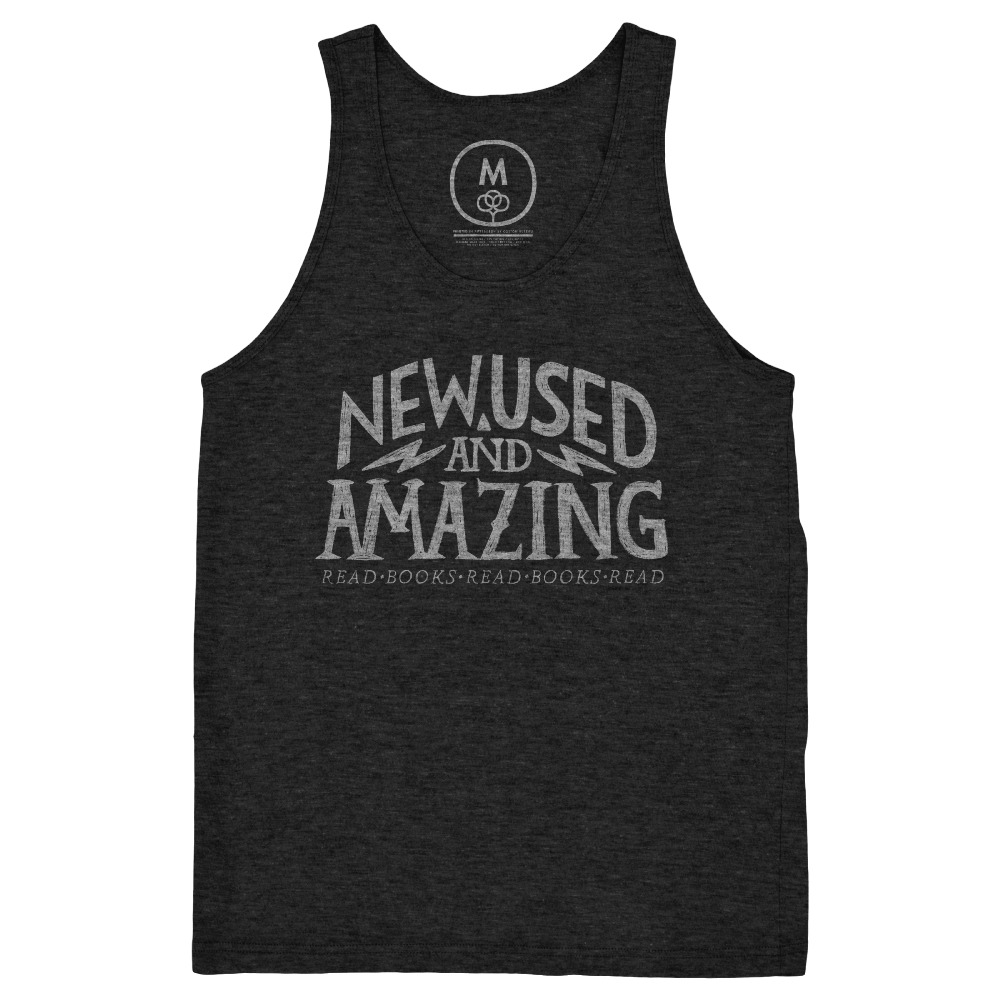
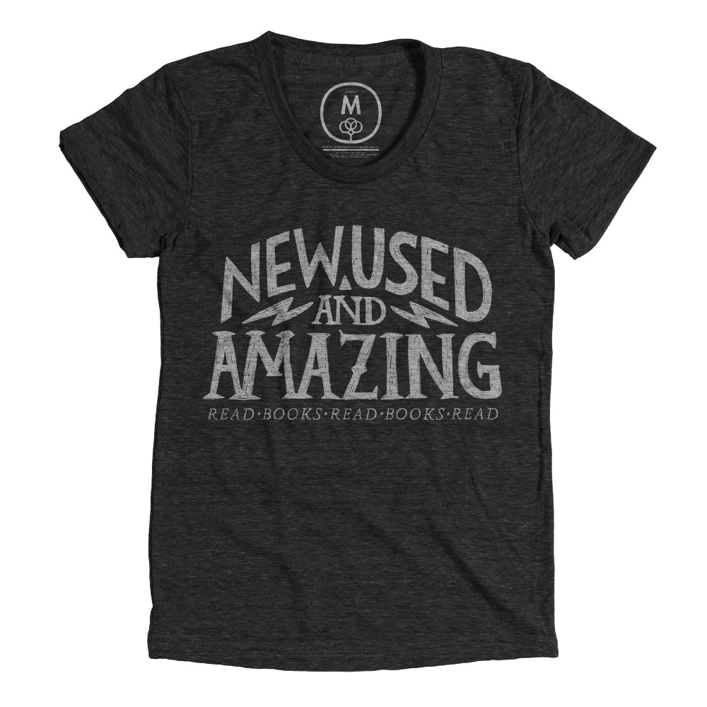
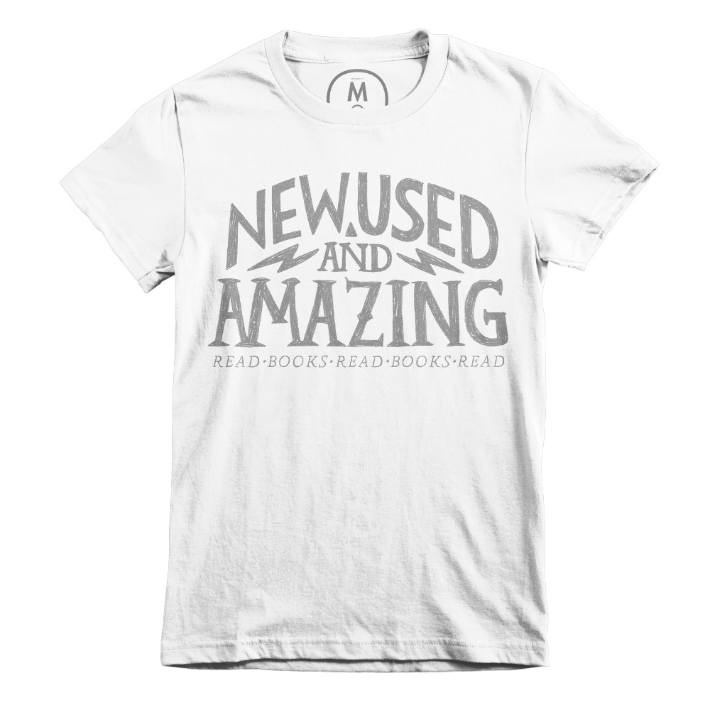
I've hand lettered type before for some of my books and I've really enjoyed it. But I wanted to see how I would do if I focused more of my daily attention at making words more illustration and pictures more graphic. This is one of those results. Because I was thinking about books and words I thought of phrases. New and used books and bookstores are a thing already, but how about tacking on the word AMAZING? It gets the idea across that yeah books can be either new or used, but they're all pretty amazing. They have the ability to transport the reader, make that person feel something new or different, they're pretty incredible.

This design was the my initiation into the graphic world of letters and I'm hooked. I've drawn a bunch of other designs and have a bigger plan for them but first I want to see how others feel about it. I submitted the design to the Cotton Bureau and I've got less than 14 days now to sell 12 shirts. The design will be printed on a black, tri-blend t-shirt, a white cotton t-shirt, and a black, tri-blend tank top. Men and women's sizes and fits. 

You can pre-order these shirts at: https://cottonbureau.com/products/new-used-and-amazing And thanks for your support! Also, if you're an illustrator, I highly recommend getting down to business with typography. Print some interesting typefaces out and just trace them, you'll be surprised at how fun that can be. Once your hand knows the nooks and crannies you can do it without tracing and add your own vibe to it.

Thursday 03.23.17
Posted by Benjamin Schipper
 

Making a Printed Portfolio

PRINTED portfolio?! You ask. 

Yessir. I again traveled to the ice cold city of New York, New York on February of this year(2017) for the annual SCBWI(society of children's book writers and illustrators) conference. I was there, in person, in the flesh with no computer to hide behind. This meant as well that my work had to be mobile, agile, hostile...sorry, got carried away.

I don't have an iPad and the last thing I wanted was to show people my work on my tiny iPhone screen. PLUS I love print. Most of us maybe are illustrating for print, books, magazines etc. It's all the more helpful for your viewer to see and handle your physical artwork. So I made a full sized portfolio, inserted printed pages into my Pina Zangaro. I also wanted to have a small booklet portfolio to give away to friends, art directors and editors.

To do this you've got to know Adobe InDesign (check some tutorials online) or have a really close friend that does. Also helpful to know something about basic graphic design, the spacing and layout of your images and text. When in doubt keep everything really simple, no flourishes and frills, just the facts ma'am. Let your art be the focal point and not have to fight with background paper color or filigree typefaces.

While assembling this portfolio keep in mind what your best work is, but also who your audience will be. For me it was the children's literary world. I included work that featured fun characters in interesting situations.

Where to print might be your biggest trouble. If you have a college or university near you that has a dedicated printing and bookmaking facility (resource for teachers and students, as well as the public sometimes) I would suggest trying that. They usually have very low cost and aren't in a business mindset like Fedex Office or something like that. It's a slower pace and if you can establish a nice relationship with the people in charge it will only help you out.

For added effect I ordered clear, plastic sleeves for my small portfolio. To me it felt more like a cool gift, like a mint condition comic or something. I also inserted business cards into each of them, knowing they wouldn't fall out because of the sleeve.

If you've never printed any of your work before I definitely suggest trying it on a small scale. It will get you to start thinking about clarity in your work. Images can look very different on a backlit computer screen than in print. It takes a few adjustments for me every time to get similar values on the printed page. Good luck!

Tuesday 03.21.17
Posted by Benjamin Schipper
Comments: 3
 

Edward Gorey

I came across Edward Gorey by way of Jon Andrews, one of my college teachers, about 4 years ago. Since then I've had the sustaining belief that the terms "picturebook" or "children's literature" have a wide variaty of content, subject matter and even stylistic choices. The Gashlycrumb Tinies is a good example, it includes 26 illustrations for the 26 letters of the alphabet corresponding to the first letter of each child featured in each illustration. Every child in each illustration dies pretty horrific deaths, the most disturbing, for me, being Kate who was struck with an axe. 

The West Wing is the second Gorey book I purchased. It contains 30 illustrations of different views inside one house. It's bizarre, complete with faint spectres in the walls and often even more obscure and subtle hints that things aren't quite "right" in the West Wing. I have no idea if any of these illustrations are connected, if there's even a specific story trying to be told, but it's an interesting and unsettling flip through. Please let me know if you have any insights about it!

My third Gorey book is actually an essay by former New York Times art director, Steven Heller to accompany about 100 images of Edward Gorey's book cover designs. That's right, Edward Gorey was a very accomplished designer and typographer. This book "Edward Gorey: his book cover art & design" is awesome. I love the intersection of art and typography and this book showcases some really beautiful work by Gorey. Buy it for around $25 on Amazon or ask your local bookseller to order it for you.

Personally these books are a fantastic look back at someone who had an extremely unique voice and wasn't afraid to use it.  They also give me hope that design can be successfully "handmade". As an illustrator I'm a little more moved at the squiggly lines and imperfect letters of Gorey's drawn design style than most of the super clean design today.

Glad I could share this guy with you if you hadn't already heard of him. Go share him with someone else!

Thursday 03.16.17
Posted by Benjamin Schipper
 

Nose to the Grindstone

Hey guys! I've got something here that I hope you'll enjoy. It's a new illustration as well as the process of making it in real time on my YouTube channel.

This is my first and second sketch in my Moleskine notebook, it's pretty wiggly and sketchy but I've become more interested in idea over form at this point. Always remember sketches are ideas, don't ever let that big brain of yours get in the way at first before you get your "feelings" down on paper.

This is my blue pencil trace over of the sketch after blowing it up in Photoshop and printing it larger.

The final drawing on Canson marker paper using a Blackwing-602 pencil. Really concerned here with getting some interesting background elements, looked at alot of reference for everything in the scene, thanks Google Images!

Here's the video! Hope it's insightful, let me know if you have any questions at the bottom of the video, and if you like what you see then please subscribe to my YouTube channel!

Thursday 09.01.16
Posted by Benjamin Schipper
Comments: 2
 

Jason Brubaker's Sithrah - Kickstarter

To all you comic fans out there, if you haven't heard of Jason Brubaker well....well, you really should hear about Jason Brubaker! He's a former storyboard artist that's been doing full time comic work for awhile now. His latest comic, Sithrah can be read at Webtoons, but the print version has gone to Kickstarter a few days ago and passed it's goal in the first day! Support it now to push into the stretch goals! Here's the link to check it out: 

https://www.kickstarter.com/projects/brubaker/sithrah-book-2

In addition to making great comics Jason shares his insights into the comic industry through his book Unnatural Talent and his Youtube channel (https://www.youtube.com/user/BrubakerMotion/videos) I highly recommend both if you're at all interested in comics or just want an interesting podcast to listen to!

Oh yeah, and this is some fan art for Sithrah! first sketch on the left above, traced over with a blackwing pencil, scanned into photoshop and colored there. Hope you guys have a great weekend!

Friday 05.06.16
Posted by Benjamin Schipper
 

That Old Time Watercolor Feelin'

If you follow me on Instagram you've probably been seeing these already, you'll also know that I started making them as a result of listening to the band Lullatone. I found them on Spotify and they make music that really get's to the "kid in me", something pretty special, especially if you work in the children's literature arena.

 It's actually hard for me to stay in a "cute and cuddly" visual mode for too long, I'm naturally drawn toward more dark and mysterious subject matter, so finding this band was great, you should definitely listen to them.

As you'll see below, that gravitation towards dark and mysterious took me to this painting. I'm experimenting with one brush in particular and it's just blowing my mind. The "pastel palooza" brush in Kyle T. Webster's Ultimate Megapack is worth the whole $15 and more it takes to buy that set. 

Thursday 05.05.16
Posted by Benjamin Schipper
Comments: 4
 

Draw as You Please

This week I looked through one of my sister-in-laws books. Being a big Disney fan, she had ordered They Drew as They Pleased, a new collection of concept art from Disney's golden age. The book showcases 4 artists: Albert Hurter, Ferdinand Horvath, Gustaf Tenggren, and Bianca Majolie. If anyone's interested in visual conception, this is a good one to look through. For the most part it's pretty raw sketches, perfect for debunking that "perfect sketchbook" craving we all have.

Flipping through these pages I definitely wanted to played around with some ideas from this "old illustration" source. Naturally there were different sensibilities in a different time, I wanted to experience the same thrill that Albert Hurter felt when he drew those goofy noses on his characters. 

As a kid I can remember these "sausage" noses very clearly, they were actually quite disturbing at the time. I can now see them being used that way specifically to great effect. By and large I feel like the nose of a character in modern illustration is slightly overlooked, maybe just by me though. Here's to bringing some noses back! 

If you've ever read and agree with Austin Kleon's Steal Like an Artist you know what a freeing thing it is to try on different styles, forms and ideas from other artists you admire. I'd say it's one of the funnest ways to warm up and play around with new ideas. You're adding to your own repertoire so, draw as you please! 

Saturday 04.30.16
Posted by Benjamin Schipper
 

A Half-tone Job

Hey everyone, just wanted to dump a few things on this blog, mainly spot illustrations I've been enjoying adding looser textures to, one of them a secret, organic looking halftone that I'm just crazy about. Live long and prosper. 

Monday 02.01.16
Posted by Benjamin Schipper
 
Newer / Older

Powered by Squarespace.